Cover Research:
Click image for larger view - front cover research.

Planning cover page:
Click image for larger view - front cover research.

 The image to the left is my hand drawing for the planning of my cover page. Each of my designs are completely different as I wanted to see which style would look best for my magazine and which one seemed more realistic and professional. However on each design idea I have planned to have the cover lines around my image or slightly over the edge of the image.
I split my page into quarters and only done small designs of each idea, but my chosen design I then went onto drawing it larger on the computer using publisher.
If i was to complete this task again I think that I would design my covers with more detail and take into consideration while designing them what type of image I am going to take and what my background and cover lines will be, which will allow me to plan it exactly how I would want it.

The image to the right is showing my chosen design idea for how my cover page will be set out. I decided to have my masthead in the traditional right hand corner as it looks professional and everyone knows the layout of a magazine. The date, issue number and price is also a typical thing that you would see in the corner of a magazine. I haven't exactly decided where I want to place my sell line as I am either going to place under the masthead and issue number etc or just under the masthead or issue number etc, which the reason for my spreading it across the whole of the width of the page. below my sell line will be my main image which will be in the center of my page standing out from the rest of the magazine, around this will be cover lines which will all have a colour scheme to go with what my person in the image is wearing. Then at the very bottom of the magazine will be my bar code and the magazines 'offical website'.
Image Planning:

The image shown on the right is my planning idea for how I wanted my images to look and who I could have in them. My first idea was to have an A-level student standing outside the entrance of the school holding their file and textbooks with one hand and the other throwing their revision up in the air, as if a sigh of relief exams are over, which would be a cover line so that people would know that the image connoted that. My second image was just an A-level student standing holding their file and textbooks, which was the choice I went with. My third choice was a teacher standing at a white board teaching a lesson and my final on was our head teacher standing outside with the school in the background behind him.
As I had chosen which image I was going to do, it made it a lot easier when going to take the actual image.
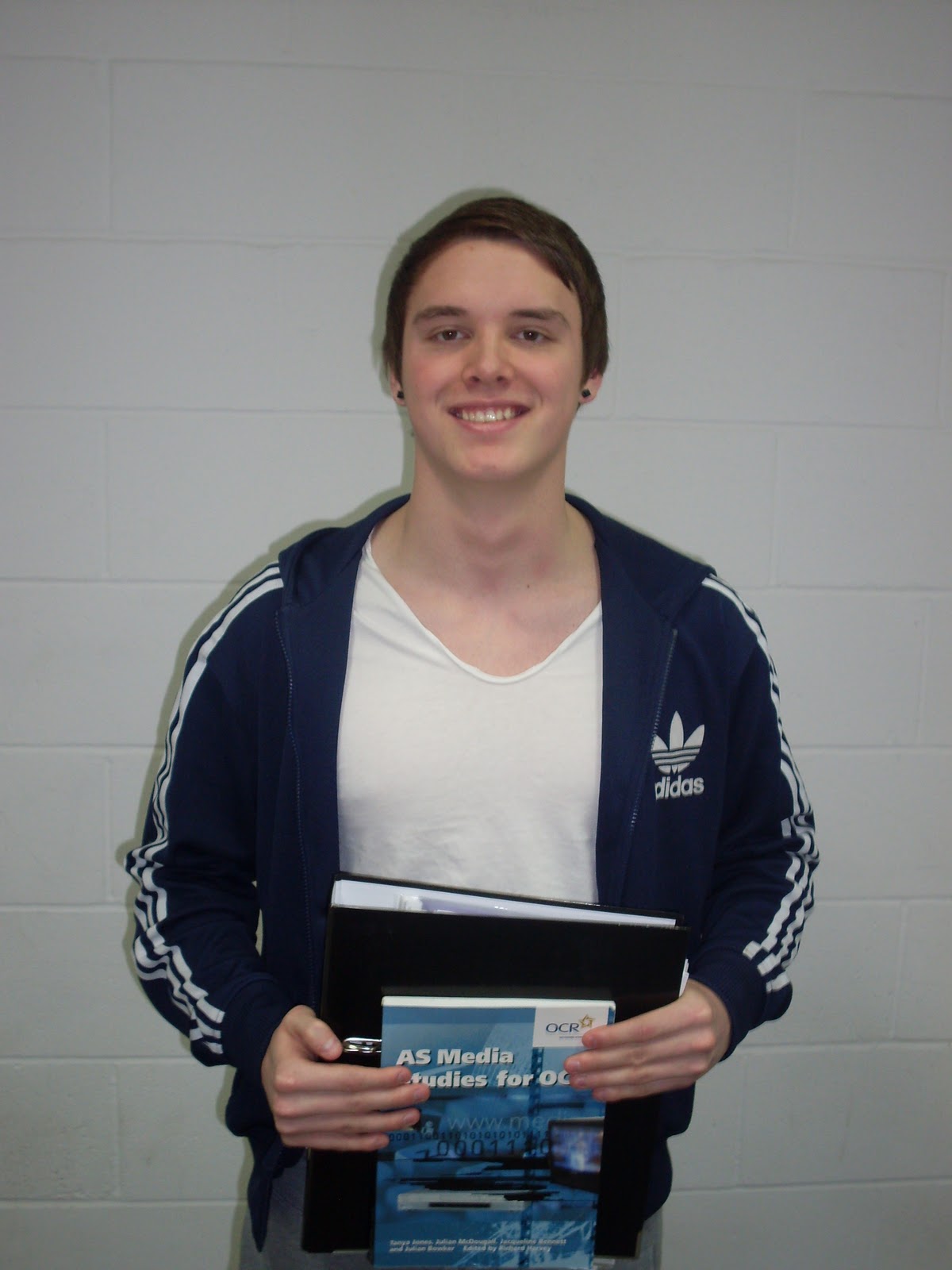
The photo to the left was my original photo taken before I edited it for my magazine. Once I took this photo though I decided that I wanted it to be outside the school so I took an image of the school building from a distance and decided I would blur the whole of that image then cut my model out from the background and place him on the image. However when I done this, he looked out of place and as though I just stuck him on. This meant that I just had to go with the edited image of him cut out from the background and place on a coloured background that would not draw too much attention.
The images below shows the image of the school I had taken, the edited image of my model and also the image I tried to edit by placing my model in front of the school which I was unable to use because he looked as big as the school and out of place. Which meant I therefore had to just use the image of my model on his own; when taking the image I should have taken it of him outside the school and this wouldn't of been a problem.

Final Cover:

Contents research and planning:
Unfortunately I fell behind on work because I took long on doing my cover research analysis and the actual creating of my cover, which meant I had to skip doing my and drawn contents planning and go straight on to producing my contents inal plan on publisher. However before I was able to produce any plans I had to do some resaerch on sontents pages and analyse them, to give me a better understanding of how the contents page should be layout and what should be included on the page. Below is a image of contents research.
 |
| Click the image to view larger - contents research |
No comments:
Post a Comment