Wednesday 2 February 2011

Music magazine cover research

Click image to view larger


Click image to view larger


Click image to view larger


Music magazine contents page research

Click image to view larger

Click image  to view larger

Click image to view larger


Music magazine double-page article research

Target audience research

On my research into how to gain audience feedback I created a questionnaire which was given out to pupils within sixth form. My target audience is people aged 16-18, the reason for this is because they are the same age group as me, which would allow me to gain feedback from them which I could hopefully relate too. Also producing a magazine aimed towards people my age would be easier than aiming it towards people older or younger than me as I don't have the same point of view towards things as they do and most likely wont like the same type of music as them. Below is a image of the questionnaire I gave out for people to answer:
 

As you can see I kept the layout of my questionnaire very plain, with simple short questions. The reason for this is because if my answerer's found that the questions were too long they wouldn't be willing to answer it, also if all the questions were cramped together, it would make it difficult for them to understand which box they are supposed to tick for which answer. The format for my question was a straight forward question with a number of answers for them to choose from by ticking the box next to it, I also had a few question and written answer questions for them to respond to.
The questions and answers:
1. what gender are you?      
Male/Female
2. does your current play list mainly include chart music?       Yes/No
3.what style article do you prefer?       question&answers/article
4.what genre of music do you listen to?       pop&chart /jazz/R&B/rap/dance/pop-rock/indie/screamo/rock/classical/other
5. which shot distance appeals most to you?       extreme close up/ close up/ medium close up/ medium shot/ full length/ long shot   -for these answers I had an image showing examples of each shot.
6. what so you think the magazine should be called?       My answerer just had to write their own opinion on the lines provided.
7. who would you prefer to be featured on the cover?       girl group/ boy group/ solo male artist/ solo female artist/ mixed group
8. name three artists you would like to see on the cover?       My answerer just has to write their own opinion on the lines provided.
9. how many images should there be on my contents page?       1 full page image/ 1 main image/ 2 smaller images/ 3 smaller images/ other
10. do you have any other suggestions towards my music magazine, that would make you more likely to buy it?       My answerer just has to write their own opinion on the lines provided


The results:I handed out 19 questionnaires in total which gave results which would certainly help to create my magazine and allow me to make a definite decision on what I should include in my magazine which would appeal to my target audience. However I have to take into account that some of my questionnaires weren't answered correctly as a few people just tended to tick any random box, I realised this by their written answers, for example one of my responses to question 8.'Name three artists you would like to see on the cover?', was 'me, myself, I'.


The results to the left show that most people in my target audience were male. The reason for me asking this question was because I wanted to know if males had a different point of view towards my questions than what females did, this was proved wrong because the majority of each sex answered the questions the same. I knew that some people wouldn't answer my questionnaire seriously, which I thought would be the males but their was a few females that couldn't be bothered to answer my written questions, despite this I still got valid answers that I am able to relate too.

To the right is the results regarding whether or not people mainly listen to chart music (recent up to date music in the charts). The majority answered yes, however there was still quite a large amount of people who answered no. The reason for asking this question was to give me an idea of who I should include within the magazine that would appeal to my target audience to make them buy it; the same reason for me asking question 8 (name three artists you would like to see on the cover).

The results shown on the right follows on from the question above because I wanted to look more closely into the style of music people preferred, which would allow me to be able to decide what/who I was to write about within my magazine. As I know what genre people mainly prefer this allows me to be able to know what genre I should design my magazine to be and what type of images should be used, to draw my audience in to view this magazine.

My results shown on the left have informed me that my target audience prefers a questions and answers style article, basically a interview. However despite how my target audience answered this question I decided that I was going to create a interview style article because I prefer the layout of it and I find them more interesting than a article/story that you have to sit and read. You get the point of view from the interviewee which makes interview articles more enjoyable.

The majority of my target audience selected the medium shot over the other ones given. When showing this question on the questionnaire I gave my target audience and example of each shot, so they knew what each shot was. I think the majority chosen medium shot because it the main shot that is used on most magazines because  you never tend to see a extreme close up or along shot on a magazine cover, it is always a medium type of shot.

The results shown to the right has two favourites chosen by my target audience. The two that were popular are solo female artist and mixed group; I am quite please with this result because I was going to ask a female or a male to pose for the front cover image, rather than a group image.


The results to the left have two popular results chosen because they have the equal about of people that have picked them as the best choice for how many images I should include. Depending on how well my images turn out and how much information I am wanting to put in the contents, will help me decide if I want a full page; I think I would prefer to one main image of two smaller ones rather than full page image.

Music magazine cover planning

Before I was able to start creating any part of my cover, I had to plan it all out. I firstly started my planning by deciding on a name, which was easy as I had asked my target audience what they thought my magazine should be called; once receiving my results I picked the best three out and chose my favourite one. I then went on to planning the layout of my cover on paper which I was then required to pick the best one and sketch it up in publisher. Once I had completed all of the above tasks I then went onto more detailed planning of choosing my font styles and colours. The images below are of a photocopy of each of my sketched which I completed on paper:

The image to the left was my first draft copy that I completed for planning how my cover should look; however I don't like the layout of this design at all because I don't think I've included enough cover lines on the cover, also it has a lot of blank plain spaces, which will make it look unprofessional and boring.
However this is the reason for doing more than one draft design on paper because my ideas expanded when I started designing, I also took into consideration how other magazines had designed their covers.


The image to the left was my second draft plan for my front cover, as you can see this one is a different layout for everything as I don't have any cover lines covering my image and I have shown more detail into the size of my cover lines, also I have included more conventions on this cover, as I have a badge type  item in the corner which includes the price inside of it, to attract the audiences attention more. However I still don't like this layout because I don't think I should just have all my cover lines on one side of the cover.


Again this is another draft version of my planning for the cover of my magazine, this time I included more cover lines on the magazine because I didn't think I was including enough on all of my other designs. However I don't like the layout of the cover lines because I don't think it would be a very clear formatting to view the cover lines if they are diagonal. The position of the bar code isn't positioned very well because I now don't think that it should be at the top of the page, but at the bottom because I don't want attracting a lot of attention from my audience as it isn't the main focus of the magazine.


The two images either side are my final draft copies, I firstly designed it on paper like all my other copies, because this was my final version designs I had to create a publisher copy of it. I choose this design to do because I felt that this was my best design as I had reviewed all the covers that I had analysed and took a design idea from just about each one, the reason for me doing this is because I then knew that my magazine would look like an actual one.


Once I had decided on what layout I would be using for my magazine I then started planning the font to use for my masthead and cover lines. I done this by writing my masthead out in different fonts in bold and a large size, I wrote next to each sample the name of the font in a smaller size to see how it would look as a cover line. Once I had decided on my font I then started creating a draft version of my cover in black and white, I done this for when I went to create my real cover I could just use my draft one and change it to my colour scheme and add my own image that I had taken. I created my draft version as though it was my final cover so that when I created my cover and got feed back I would only have to do little changes to it. Below is a image of my font samples and my draft front cover:

Music magazine contents page planning

Before I was able to start creating any part of my contents, I had to plan it all out. I firstly planned four different designs out on paper by hand, then choose my best design and created another copy of it in publisher. I had to analyse a number of different contents pages before being able to create my won, so that I had a clear understanding of how a contents page was to look. In my questionnaire I also included a question about how many images my target audience thought should be included within my contents, which made it easier when thinking of design ideas. The images below are of photocopies of my hand drawn design ideas:

The image to the left was my first draft to the contents planning, I quite liked this design because it was a clear layout with a image on the left hand side of the page then a list of the page titles and numbers on the right hand side, with the title above it. I included two columns then another small image in the bottom right corner. Although I liked this layout I couldn't have used it as my target audience answered my questionnaire saying that they only want one main image included on my contents page. If I was to have more than one image I wouldn't be taking in to consideration what my target audience like to be included within a contents page.


The second design I produced I think was worse than the first one because now that I look back at my design I don't like  the idea of having the band index, when I didn't have a particular genre for the magazine it would be rather pointless in having it. However I like having the headings above the list of titles and numbers of the pages; it allows similar pages to become grouped together making it easier for my target audience to know where to look on the contents when looking for a cover line that was on the cover etc.


This design is possibly the worst out of all of them because I don't like the layout of the title and the idea of having a full page image. I think everything on this design is all cramped together and not well planned out. The idea of having a full page image would also not work on a contents page because of the about of text will be included within it; the image would most likely be of a person so the actual page wouldn't be very clear because there would be so much included on the page that you would know where to look or be able to make any of the writing out. Although the full page image was one of the top voted answers from my target audience, I have decided against using a full page image.


The two images either side are my final copies of my contents. The reason for me having one hand drawn and one done in publisher is because this is that actual layout I have used for creating my contents page. I choose this layout because I liked the idea of having a main image with a caption from one of their songs then the name of the band or singer under or above it. I kept the idea of having the headings above each title of the pages because it allowed my target audience to know easily where to look for the page they are wanting to turn to. I decided to include a review of a CD because it filled in a blank space which would have looked stupid if I left it blank.

Once i had decided on the layout of my contents page I then created a draft version of my contents page, I decided to create this because when I went to create my final copy I only had to change my colour scheme and add in my own image that I had taken myself. Below is my draft copy of my contents page:

Music magazine double-page article planning

Before I was able to start creating my double page spread, I had to plan it all out. Before I was able to plan my double page spread I had to analyse a number of double page spreads to allow me to know what a double page spread looked like and required to become. I planned four double page spreads on paper by hand first then my final choosen one was created in publisher for me to copy when creating my actual cover. The images below are of the photocopies of my hand drawn designs:

The image to the left is my first design I created for the double page spread I really don't like this design because I think there is too much going on which would mean it wont attract my audience's attention into wanting to read this article. This design doesn't really have a double page spread layout either as it doesn't look very much like a magazine.
The image to the right was my second design for my double page spread again I think I have designed this one to be too cramped, as I think I have included too many columns and only a little image. Most magazines that you look at, have at least one large image, so this design wouldn't work as a double page spread for a magazine
My third design is a bit better than my two previous ones because I have included two images on this one and a larger title, which will make it more appealing to my target audience as they won't just look at the page and think that there is too much to read. 


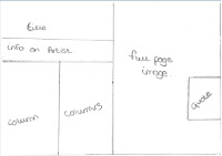
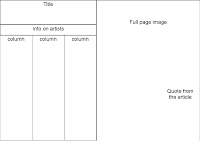
The imagesabove are my final designs for creating my double page spread. The reason for this design being my chosen design is because they have the layout that looks most like a magazine double page spread. I also think that this type of article will be most suited towards my target audience because they are young and probably wont be willing to read pages full of text.

 Once I chose the layout I wanted for my double page spread I created a draft version of it in black and white, which made it easier for when I went to make my final copy as all I had to do was add in my open images then change the colour scheme to my chosen colours. Below is a image of my draft double page spread: