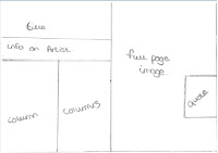
The image to the left is my first design I created for the double page spread I really don't like this design because I think there is too much going on which would mean it wont attract my audience's attention into wanting to read this article. This design doesn't really have a double page spread layout either as it doesn't look very much like a magazine.
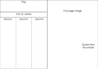
The image to the right was my second design for my double page spread again I think I have designed this one to be too cramped, as I think I have included too many columns and only a little image. Most magazines that you look at, have at least one large image, so this design wouldn't work as a double page spread for a magazine
My third design is a bit better than my two previous ones because I have included two images on this one and a larger title, which will make it more appealing to my target audience as they won't just look at the page and think that there is too much to read.


The imagesabove are my final designs for creating my double page spread. The reason for this design being my chosen design is because they have the layout that looks most like a magazine double page spread. I also think that this type of article will be most suited towards my target audience because they are young and probably wont be willing to read pages full of text.
Once I chose the layout I wanted for my double page spread I created a draft version of it in black and white, which made it easier for when I went to make my final copy as all I had to do was add in my open images then change the colour scheme to my chosen colours. Below is a image of my draft double page spread:


No comments:
Post a Comment